示例提示词
Character Name: [{argument name="character name" default="☆Set character name here☆"}] Advertising/Poster/Promotional Key Visual Generation Prompt
0. Purpose of this Prompt (Highest Priority)
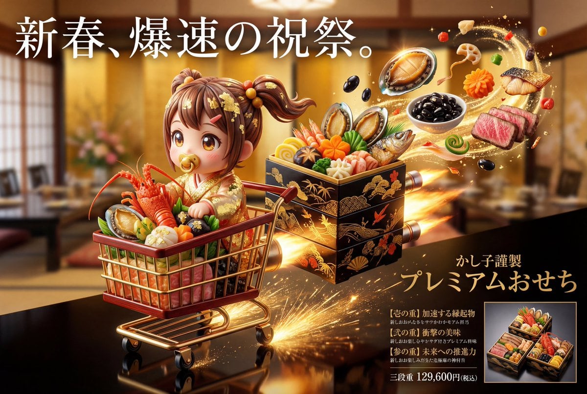
This prompt is for **“generating a photorealistic image of Osechi cuisine” that is also a “key visual for advertising posters and promotional materials aimed at department stores, luxury restaurants, and limited sales.”** The generated image must prioritize the following: Completion level recognizable as an “advertisement” at a glance.
The Osechi is the “main product” but is strongly boosted by the tiered structure, menu, world view, and character elements. 1. Overall Visual Premise (Advertising Declaration | Boost Design)
This key visual assumes an advertising design where the direction of expression significantly changes based on the characteristics of the reference image. This prompt does not aim for a stable solution but extracts the strongest element (luxury, strangeness, humor, specialty, etc.) from the reference image and boosts the entire advertising expression through high-quality, high-sense, and excessively eccentric, genius representation. The direction is automatically determined by the impression of the reference image. However, regardless of the direction, the image must be conscious of being an “advertisement that works in a department store's New Year's sale.” This boost result is consistently reflected and visualized in the subsequent composition, tier structure, copy, and menu.
2. Scene/Moment (A Moment Cut Out as an Advertisement)
Automatically selects the moment that is most appealing as an advertisement and instantly conveys “what kind of existence” the Osechi is. This prompt does not fixate on a specific production pattern but defines the “moment cut out” as the state where the information density and narrative are highest among the tiered box, cuisine, structure, and world view. The tiered box may be closed or open. The whole may be visible, or only a part may be emphasized. The time is not fixed (just before, just after, or during movement). It must be a high-quality, high-sense, and uniquely eccentric Osechi that captures attention instantly, and the optimal structure, angle, and state are automatically selected for this purpose.
3. Composition/Shooting Style (Advertising Layout Premise)
Place the Osechi tiered box in the center to slightly foreground of the screen.
Luxury food advertising angle from the front to slightly diagonally above.
Intentional negative space for placing copy and menu.
Technical conditions:
8K resolution
Ultra-photorealistic food photography
Department store/luxury restaurant advertising quality
4. Packaging/Tiered Box Design
The tiered box is designed as the **“outer shell” that most purely reflects the characteristics of the reference image.** The basic structure starts from a “tiered box that works under the supervision of a department store/long-established store,” but changes freely, high-quality, high-sense, and eccentric according to the impression of the reference image.
5. Osechi Body (Product Persuasiveness)
The cuisine composition is not limited to “Japanese” but is designed as celebratory cuisine freely expanded based on the individuality of the reference image. It may follow or deviate from traditional Osechi, and the most suitable culinary system for the impression of the reference image is reconstructed each time. What is important is not the style, but the instant establishment of luxury, festivity, and specialness.
6. Character Expression (Edible Celebration World)
All characters are entities composed of food ingredients, reinterpreted into New Year's costumes that match the concept while exaggerating the features of the reference image. Although the materials are food, priority is given to expressions that make them feel as if they are breathing, moving, and lively in that world. The character is treated as an existence that has existed in the Osechi world from the beginning, not as a “man-made object.”
7. Color Design
The color scheme is automatically determined as the optimal solution derived from the reference image and concept, without fixed rules. The cuisine, tiered box, character, and background establish luxury and festivity through texture, density, and contrast, rather than color.
8. Advertising Copy/Menu Design (Most Important)
Copy and menu naturally arise as a result of verbalizing the characteristics and concept of the reference image. Text is placed on the screen as a “visual element to make people feel something the moment they see it.” The menu is an enumeration of dish names that cleverly twist the features of the reference image with high sense and intense humor. The 2026 year display, selection concept, specially made, and main price are each placed in an effective position with high-sense, high-quality, ultra-unique, and genius design decorative text that matches the concept.
9. Variation Display (For Advertising)
Display single-tier/two-tier/three-tier boxes in a wipe style.
Small frame + product name + price.
Size that does not interfere with the main tiered box.
10. Background/Light
Based on soft New Year's light but arranged according to the characteristics of the reference image.
Maximize the luster of lacquer, gold leaf, and food ingredients.
11. Final Tone (Output Guideline)
An advertising visual that looks genuinely sellable but transcends reality—where celebration and strangeness arise simultaneously. Character × Osechi × Completed Advertising Key Visual.
Pro Tip:
This character style prompt has been tested and optimized for best results. You can modify it slightly to customize the output while keeping the core structure intact.